National Ecological Observatory Network
Connecting ecological data to place
The National Ecological Observatory Network (NEON) collects ecological data across 81 field sites throughout the United States. I designed and tested geospatial experiences that helped researchers understand where data was collected, evaluate sites, and find measurements relevant to their work.

Timeline
2015
Role
Design Coordinator
My Focus
Research · Interaction Design · Visual Design · User Testing · Accessibility
Collaborators
NEON scientists and field staff, development and content teams
Ecological data is more useful when you understand where it came from.
The challenge
NEON's data was connected to a complex network of field sites, sampling plots, sensors, and instruments. But researchers lacked an intuitive way to see that spatial context while evaluating data for their work.
I focused on bringing place and data together, using research to understand how scientists explored field sites and testing whether interactive maps could better support those workflows.
Project Highlights


Understanding how scientists choose sites
Need
Researchers needed to quickly determine whether a field site collected measurements relevant to their work.
Goal
Understand how scientists evaluated sites and what information they needed before choosing data for analysis.
Role
I reviewed support requests, interviewed stakeholders, and analyzed existing user journeys to identify recurring research workflows.
What We Learned
Users wanted to:
Evaluate sites quickly
Researchers wanted to know whether a site collected relevant measurements.
Explore geographically
Many started with a location or ecosystem rather than a dataset.
Compare before deciding
Researchers often evaluated multiple sites before selecting data.

Finding the right interaction model
Need
Knowing what happened at a site wasn't enough. Researchers needed to understand the spatial relationships between sampling locations, instruments, and measurements.
Goal
Determine whether a traditional site experience or an interactive, GIS-inspired map better supported site discovery.
Role
I designed two competing concepts and conducted moderated usability testing with representative users.
What We Leared
The map first concept won.
Participants completed site-discovery tasks more quickly and navigated with greater confidence using the GIS-inspired experience. The research validated geographic exploration as the foundation of the experience and gave us a clear direction for the final interaction model.
Refining the map through user testing
Need
The map had to represent dense scientific sampling information without overwhelming researchers or hiding important controls.
Goal
Iteratively improve how users explored layers, interpreted sampling locations, and moved from the map into the underlying data.
Role
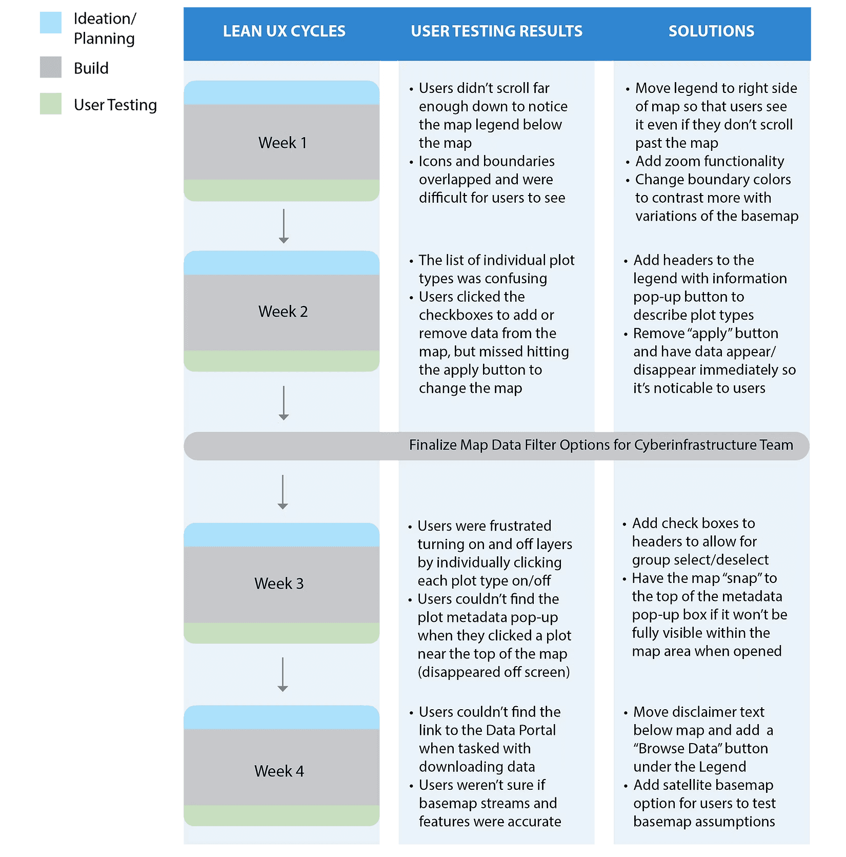
I structured a series of rapid design and usability-testing cycles, translating observed problems directly into interaction changes.
What We Learned
Make controls visible
Finding: Users often missed the legend below the map.
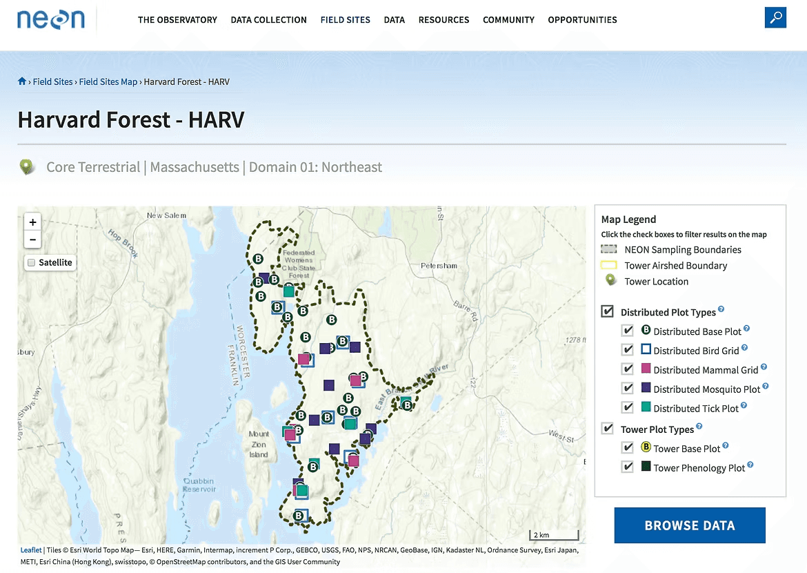
Change: Moved the legend alongside the map so filters remained visible during exploration.
Make filtering immediate
Finding: Users expected layer checkboxes to update the map instantly.
Change: Removed the additional Apply action and made filtering responsive to selections.
Make data easier to reach
Finding: Researchers struggled to find the path from mapped measurements to downloadable data.
Change: Introduced a prominent Browse Data action directly alongside the map.
A map built around how researchers actually explored
The final experience connected field locations, sampling designs, measurements, and data access in one interface, helping researchers understand not only what NEON measured, but where and how those measurements were collected.
Outcomes
Consistency across 81 field sites
A common interaction model that could support terrestrial and aquatic sites with very different sampling designs.
Research-driven
Repeated usability testing shaped the interaction model, filtering behavior, map controls, and paths to data.
Spatial by design
Geographic context became part of the core discovery experience rather than a supplementary visualization.
Takeaways
Design around how people think about the problem
Researchers thought in terms of places, ecosystems, and measurements, not the underlying structure of the data. Designing around that mental model made spatial exploration a natural starting point.
Let research change the direction
Testing competing concepts showed that the GIS-inspired experience better supported researchers’ workflows. Research was most valuable when it helped us choose what to build, not just refine what we had.
Make context part of the experience
For ecological data, location and sampling context weren’t supplemental details. Bringing them directly into the interface helped researchers understand what the data represented and whether it was relevant to their work.
A principle I still design by
For spatial problems, location isn't context. It's part of the answer.


National Ecological Observatory Network
Connecting ecological data to place
The National Ecological Observatory Network (NEON) collects ecological data across 81 field sites throughout the United States. I designed and tested geospatial experiences that helped researchers understand where data was collected, evaluate sites, and find measurements relevant to their work.
Timeline
2015
Role
Design Coordinator
My Focus
Research · Interaction Design · Visual Design · User Testing · Accessibility
Collaborators
NEON scientists and field staff, development and content teams
Ecological data is more useful when you understand where it came from.
The challenge
NEON's data was connected to a complex network of field sites, sampling plots, sensors, and instruments. But researchers lacked an intuitive way to see that spatial context while evaluating data for their work.
I focused on bringing place and data together, using research to understand how scientists explored field sites and testing whether interactive maps could better support those workflows.
Project Highlights
Understanding how scientists choose sites
Need
Researchers needed to quickly determine whether a field site collected measurements relevant to their work.
Goal
Understand how scientists evaluated sites and what information they needed before choosing data for analysis.
Role
I reviewed support requests, interviewed stakeholders, and analyzed existing user journeys to identify recurring research workflows.
What We Learned
Users wanted to:
Evaluate sites quickly
Researchers wanted to know whether a site collected relevant measurements.
Explore geographically
Many started with a location or ecosystem rather than a dataset.
Compare before deciding
Researchers often evaluated multiple sites before selecting data.
Finding the right interaction model
Need
Knowing what happened at a site wasn't enough. Researchers needed to understand the spatial relationships between sampling locations, instruments, and measurements.
Goal
Determine whether a traditional site experience or an interactive, GIS-inspired map better supported site discovery.
Role
I designed two competing concepts and conducted moderated usability testing with representative users.
What We Leared
The map first concept won.
Participants completed site-discovery tasks more quickly and navigated with greater confidence using the GIS-inspired experience. The research validated geographic exploration as the foundation of the experience and gave us a clear direction for the final interaction model.
Refining the map through user testing
Need
The map had to represent dense scientific sampling information without overwhelming researchers or hiding important controls.
Goal
Iteratively improve how users explored layers, interpreted sampling locations, and moved from the map into the underlying data.
Role
I structured a series of rapid design and usability-testing cycles, translating observed problems directly into interaction changes.
What We Learned
Make controls visible
Finding: Users often missed the legend below the map.
Change: Moved the legend alongside the map so filters remained visible during exploration.
Make filtering immediate
Finding: Users expected layer checkboxes to update the map instantly.
Change: Removed the additional Apply action and made filtering responsive to selections.
Make data easier to reach
Finding: Researchers struggled to find the path from mapped measurements to downloadable data.
Change: Introduced a prominent Browse Data action directly alongside the map.
A map built around how researchers actually explored
The final experience connected field locations, sampling designs, measurements, and data access in one interface, helping researchers understand not only what NEON measured, but where and how those measurements were collected.
Outcomes
Consistency across 81 field sites
A common interaction model that could support terrestrial and aquatic sites with very different sampling designs.
Research-driven
Repeated usability testing shaped the interaction model, filtering behavior, map controls, and paths to data.
Spatial by design
Geographic context became part of the core discovery experience rather than a supplementary visualization.
Takeaways
Design around how people think about the problem
Researchers thought in terms of places, ecosystems, and measurements, not the underlying structure of the data. Designing around that mental model made spatial exploration a natural starting point.
Let research change the direction
Testing competing concepts showed that the GIS-inspired experience better supported researchers’ workflows. Research was most valuable when it helped us choose what to build, not just refine what we had.
Make context part of the experience
For ecological data, location and sampling context weren’t supplemental details. Bringing them directly into the interface helped researchers understand what the data represented and whether it was relevant to their work.
A principle I still design by
For spatial problems, location isn't context. It's part of the answer.
National Ecological Observatory Network
Connecting ecological data to place
The National Ecological Observatory Network (NEON) collects ecological data across 81 field sites throughout the United States. I designed and tested geospatial experiences that helped researchers understand where data was collected, evaluate sites, and find measurements relevant to their work.
Timeline
2015
Role
Design Coordinator
My Focus
Research · Interaction Design · Visual Design · User Testing · Accessibility
Collaborators
NEON scientists and field staff, development and content teams
Ecological data is more useful when you understand where it came from.
The challenge
NEON's data was connected to a complex network of field sites, sampling plots, sensors, and instruments. But researchers lacked an intuitive way to see that spatial context while evaluating data for their work.
I focused on bringing place and data together, using research to understand how scientists explored field sites and testing whether interactive maps could better support those workflows.
Project Highlights
Understanding how scientists choose sites
Need
Researchers needed to quickly determine whether a field site collected measurements relevant to their work.
Goal
Understand how scientists evaluated sites and what information they needed before choosing data for analysis.
Role
I reviewed support requests, interviewed stakeholders, and analyzed existing user journeys to identify recurring research workflows.
What We Learned
Users wanted to:
Evaluate sites quickly
Researchers wanted to know whether a site collected relevant measurements.
Explore geographically
Many started with a location or ecosystem rather than a dataset.
Compare before deciding
Researchers often evaluated multiple sites before selecting data.
Finding the right interaction model
Need
Knowing what happened at a site wasn't enough. Researchers needed to understand the spatial relationships between sampling locations, instruments, and measurements.
Goal
Determine whether a traditional site experience or an interactive, GIS-inspired map better supported site discovery.
Role
I designed two competing concepts and conducted moderated usability testing with representative users.
What We Leared
The map first concept won.
Participants completed site-discovery tasks more quickly and navigated with greater confidence using the GIS-inspired experience. The research validated geographic exploration as the foundation of the experience and gave us a clear direction for the final interaction model.
Refining the map through user testing
Need
The map had to represent dense scientific sampling information without overwhelming researchers or hiding important controls.
Goal
Iteratively improve how users explored layers, interpreted sampling locations, and moved from the map into the underlying data.
Role
I structured a series of rapid design and usability-testing cycles, translating observed problems directly into interaction changes.
What We Learned
Make controls visible
Finding: Users often missed the legend below the map.
Change: Moved the legend alongside the map so filters remained visible during exploration.
Make filtering immediate
Finding: Users expected layer checkboxes to update the map instantly.
Change: Removed the additional Apply action and made filtering responsive to selections.
Make data easier to reach
Finding: Researchers struggled to find the path from mapped measurements to downloadable data.
Change: Introduced a prominent Browse Data action directly alongside the map.
A map built around how researchers actually explored
The final experience connected field locations, sampling designs, measurements, and data access in one interface, helping researchers understand not only what NEON measured, but where and how those measurements were collected.
Outcomes
Consistency across 81 field sites
A common interaction model that could support terrestrial and aquatic sites with very different sampling designs.
Research-driven
Repeated usability testing shaped the interaction model, filtering behavior, map controls, and paths to data.
Spatial by design
Geographic context became part of the core discovery experience rather than a supplementary visualization.
Takeaways
Design around how people think about the problem
Researchers thought in terms of places, ecosystems, and measurements, not the underlying structure of the data. Designing around that mental model made spatial exploration a natural starting point.
Let research change the direction
Testing competing concepts showed that the GIS-inspired experience better supported researchers’ workflows. Research was most valuable when it helped us choose what to build, not just refine what we had.
Make context part of the experience
For ecological data, location and sampling context weren’t supplemental details. Bringing them directly into the interface helped researchers understand what the data represented and whether it was relevant to their work.
A principle I still design by
For spatial problems, location isn't context. It's part of the answer.
National Ecological Observatory Network
Connecting ecological data to place
The National Ecological Observatory Network (NEON) collects ecological data across 81 field sites throughout the United States. I designed and tested geospatial experiences that helped researchers understand where data was collected, evaluate sites, and find measurements relevant to their work.
Timeline
2015
Role
Design Coordinator
My Focus
Research · Interaction Design · Visual Design · User Testing · Accessibility
Collaborators
NEON scientists and field staff, development and content teams
Ecological data is more useful when you understand where it came from.
The challenge
NEON's data was connected to a complex network of field sites, sampling plots, sensors, and instruments. But researchers lacked an intuitive way to see that spatial context while evaluating data for their work.
I focused on bringing place and data together, using research to understand how scientists explored field sites and testing whether interactive maps could better support those workflows.
Project Highlights
Understanding how scientists choose sites
Need
Researchers needed to quickly determine whether a field site collected measurements relevant to their work.
Goal
Understand how scientists evaluated sites and what information they needed before choosing data for analysis.
Role
I reviewed support requests, interviewed stakeholders, and analyzed existing user journeys to identify recurring research workflows.
What We Learned
Users wanted to:
Evaluate sites quickly
Researchers wanted to know whether a site collected relevant measurements.
Explore geographically
Many started with a location or ecosystem rather than a dataset.
Compare before deciding
Researchers often evaluated multiple sites before selecting data.
Finding the right interaction model
Need
Knowing what happened at a site wasn't enough. Researchers needed to understand the spatial relationships between sampling locations, instruments, and measurements.
Goal
Determine whether a traditional site experience or an interactive, GIS-inspired map better supported site discovery.
Role
I designed two competing concepts and conducted moderated usability testing with representative users.
What We Leared
The map first concept won.
Participants completed site-discovery tasks more quickly and navigated with greater confidence using the GIS-inspired experience. The research validated geographic exploration as the foundation of the experience and gave us a clear direction for the final interaction model.
Refining the map through user testing
Need
The map had to represent dense scientific sampling information without overwhelming researchers or hiding important controls.
Goal
Iteratively improve how users explored layers, interpreted sampling locations, and moved from the map into the underlying data.
Role
I structured a series of rapid design and usability-testing cycles, translating observed problems directly into interaction changes.
What We Learned
Make controls visible
Finding: Users often missed the legend below the map.
Change: Moved the legend alongside the map so filters remained visible during exploration.
Make filtering immediate
Finding: Users expected layer checkboxes to update the map instantly.
Change: Removed the additional Apply action and made filtering responsive to selections.
Make data easier to reach
Finding: Researchers struggled to find the path from mapped measurements to downloadable data.
Change: Introduced a prominent Browse Data action directly alongside the map.
A map built around how researchers actually explored
The final experience connected field locations, sampling designs, measurements, and data access in one interface, helping researchers understand not only what NEON measured, but where and how those measurements were collected.
Outcomes
Consistency across 81 field sites
A common interaction model that could support terrestrial and aquatic sites with very different sampling designs.
Research-driven
Repeated usability testing shaped the interaction model, filtering behavior, map controls, and paths to data.
Spatial by design
Geographic context became part of the core discovery experience rather than a supplementary visualization.
Takeaways
Design around how people think about the problem
Researchers thought in terms of places, ecosystems, and measurements, not the underlying structure of the data. Designing around that mental model made spatial exploration a natural starting point.
Let research change the direction
Testing competing concepts showed that the GIS-inspired experience better supported researchers’ workflows. Research was most valuable when it helped us choose what to build, not just refine what we had.
Make context part of the experience
For ecological data, location and sampling context weren’t supplemental details. Bringing them directly into the interface helped researchers understand what the data represented and whether it was relevant to their work.
A principle I still design by
For spatial problems, location isn't context. It's part of the answer.